Introduction
After struggling to come up with a new data set to work with for this new project, I decided to redesign a couple of my worst graphs. This project has a few purposes:
It showcases my growth in programming and data visualization designing.
It takes readers through my information design process.
To keep things simple, I will be displaying the old graphs, highlighting their issues, showing my design and coding processes, and presenting the final visualizations.
Data and Packages
This project will be be featuring an old Pokemon data set that I obtained from Mario Tormo Romero’s Kaggle. Although it has been updated, I will keep using the 4-21-20 version of it.
Additionally, I will be using some of the same packages I used last time. The main difference here is that I am using more interactive data visualization packages, which was something I could not do when I began programming.
library(ggplot2)
library(data.table)
library(tidyverse)
library(knitr)
library(extrafont)
library(plotly)
library(highcharter)
library(stringi)
pokemon_data <- fread("C:/Users/laryl/Desktop/Data Sets/pokedex.csv")Improving Graph 1
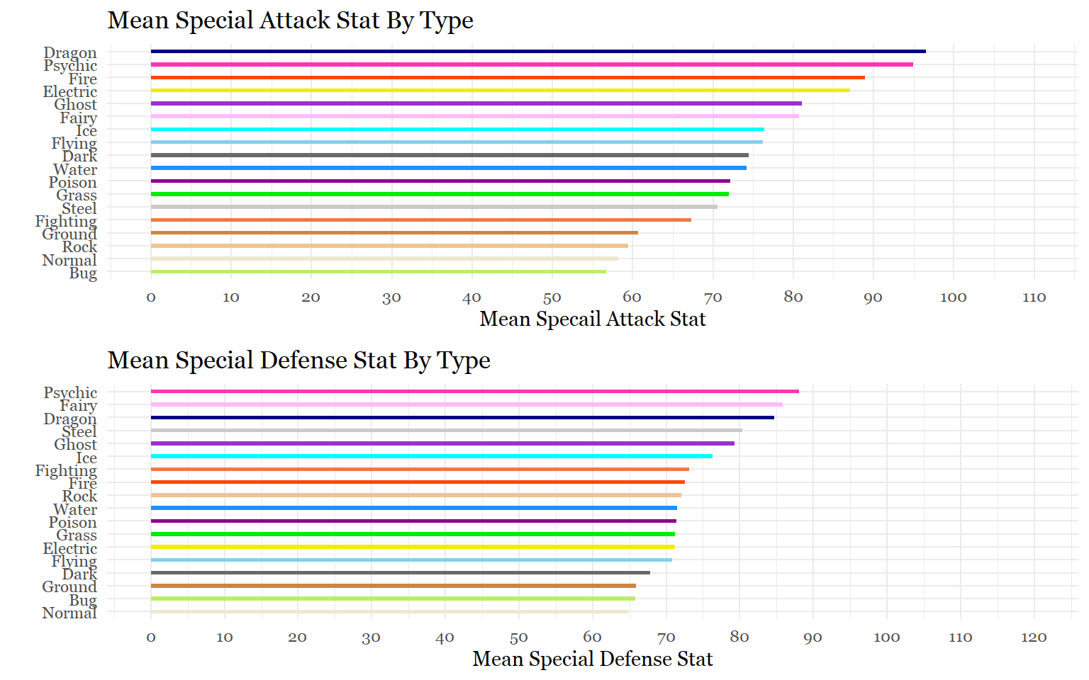
The first graph is from my very first completely self-directed project called Exploring Pokemon.
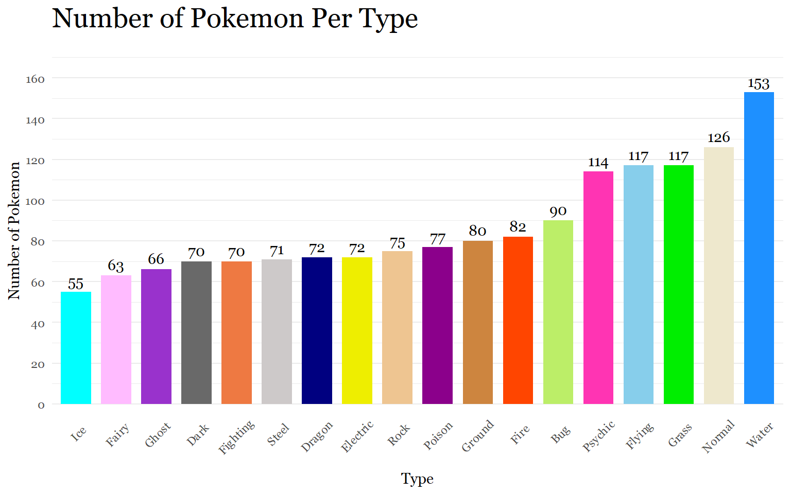
First Chart
Critiques
What is wrong with this first chart?
Firstly, when visualizing a variable with 18 categories that overlap along the x-axis, the better practice is to visualize bar charts horizontally to avoid axis label rotations. Funny enough, other visualizations in the project do this. Some might argue that the numbers on top of the bars are unnecessary and create “chart junk.” But since there were a few types that shared the same number, my thought, at the time, was that it could be helpful to see the exact numbers.
One of the most significant issues here involves using too many colors for a variable displayed across the x-axis. Although the typical bar chart is supposed to apply colors sparingly, using colors to distinguish between types is common practice in the Pokemon franchise.
However, the colors for this graph were selected using the color names I felt matched the game’s colors best (like cornflower blue instead of #6495ed). As a result, the chart is probably a crude representation of Game Freak’s color choices.
Couldn’t this chart tell a better story than this? Although this graph was an opportunity to practice making a bar chart with ggplot, I did miss an opportunity to tell a more nuanced story.
Ideation and Sketching
Original Question: How can I visualize the number of Pokemon per type?
New Questions: Can I do more? Is there a way to tell a better story and get more depth from the data?
For this chart, I decided to go to one of my favorite developers and see if there were some interesting charts I could get inspired by. Joshua Kunst is a developer who is well known in the R community for his work on highcharter visualizations. The highcharter package is a library that I have used to create stunning interactive visualizations(see one of my projects here).
After scrolling through his page, I found an example of donut chart that maximizes space by presenting a second related graph in the tooltip on the inside of the donut chart. Embedding graphs inside of tooltips is something that I have done before in Tableau but never in R.
This was exactly what I was looking for. My idea was to display the counts of the Pokemon types on the segments of the donut’s ring and then show the number of Pokemon for a particular type across generations when a segment is clicked.
Here is a rough sketch of my idea:
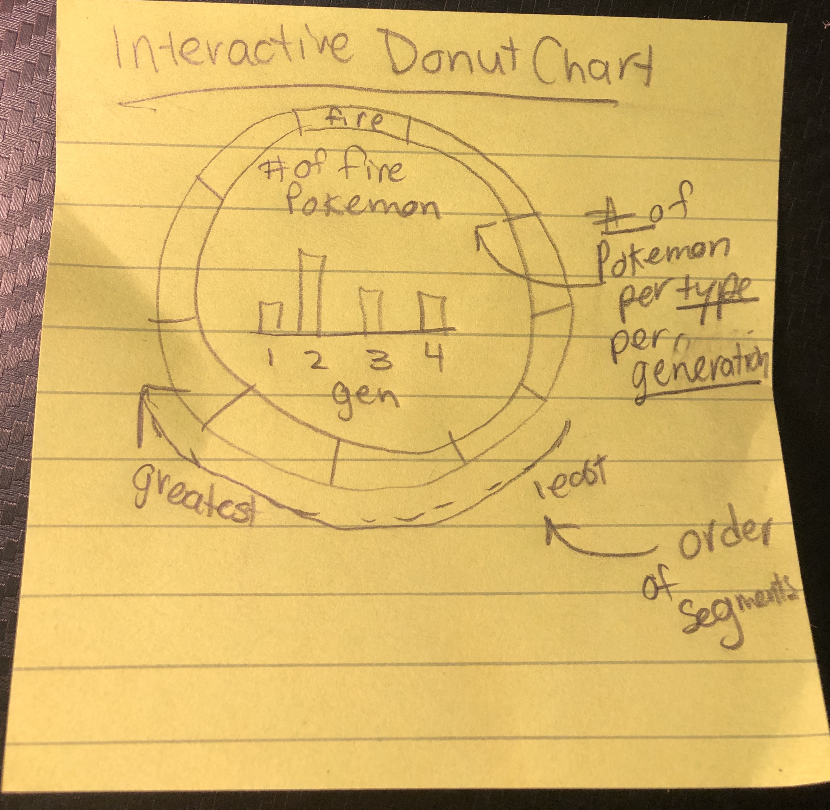
Sketch 1
Coding
Here is the code to transform the data so it is ready for visualization.
#Create two separate data frames to separate Pokemon so that they are counted twice if they have 2 types
pokemon_types1<- pokemon_data %>%
  select(name, generation, type_1) %>%
  mutate(type_half = type_1) %>%
  select(-type_1)


pokemon_types2<- pokemon_data %>%
  select(name, generation, type_2) %>%
  mutate(type_half = type_2)%>%
  filter(type_half != "")%>%
  select(-type_2)

#Combine the two dataframes
pokemon_types <- rbind(pokemon_types1, pokemon_types2)

#Count the number of Pokemon per type overall
pokemon_type_totals <- pokemon_types %>% count(type_half)  %>%
  mutate(total = n)%>%
  select(-n)


#Count the number of pokemon per generation per type
pokemon_types_counted <- pokemon_types%>% count(generation, type_half)

head(pokemon_type_totals)head(pokemon_types_counted)The biggest challenge here was nesting one data frame inside of another. Using another one of my resources, Tom Bishop’s Highcharter Cookbook I was able to finally to organize the data.
# Nest the generation counts inside of the total counts
pokemon_types_final <- pokemon_type_totals %>%
  inner_join(pokemon_types_counted, by= "type_half") %>%
  select(generation, type_half, n) %>%
  nest(-type_half) %>%
  mutate(
    nested_data = data %>%
      map(mutate_mapping, hcaes(x = generation, y = n), drop = TRUE) %>%
      map(list_parse)
  ) %>%
  select(-data)

#Arrange the data frame so that the types are ordered by counts instead of alphabetical order
pokemon_types_final2 <- pokemon_types_final %>% left_join(pokemon_type_totals)%>% arrange(total)

head(pokemon_types_final2)
Now comes the fun part: choosing a pallet and font for the graph. Since a donut chart typically displays categories by color, this time it makes sense to use the colors that are associated with the types.
However, for this graph, we will be using a modified pallet that Game Freak created for their most recent iteration of Pokemon Games. The pallet features more mutated and less varied colors.
# Pallet
pokemon_pallet <- c(  "#73d0bd"  , # Ice
                        "#ed91e3"  , # Fairy
                        "#526aad"  , # Ghost
                        "#5a5467"  , # Dark
                        "#ce4267"  , #Fighting
                        "#5a8fa3"  , # Steel
                        "#0c6cc4"  , # Dragon
                        "#f4d43b"  , # Electric
                        "#c6b88a"  , # Rock
                        "#a96ac9"  ,  #Poison
                        "#d97846"  , # Ground
                        "#ff9d54"  , #Fire
                        "#91c12c" , # Bug
                        "#fb717b"  , # Psychic
                        "#90a9dc"  , # Flying
                        "#63bc5a"   , # Grass
                        "#909ca2" , # Normal
                        "#4e92d2")

#Font
my_theme <- hc_theme(
    chart = list(
        style = list(
            fontFamily = "Georgia")))
My idea was to use a bar chart in the tooltip. But I realized that an area chart, like the one found in Tom Bishop’s interactive donut chart, guides the eye across change over generations better than bar charts do.
hchart(pokemon_types_final2, "pie", hcaes(name = type_half, y =  total), innerSize = 300) %>%
    hc_tooltip(
    useHTML = TRUE,
    headerFormat = "<b> {point.y} <span style='color:{point.color};'>{point.key}</span> Pokemon in Total </b>",
    pointFormatter = tooltip_chart(
      accesor = "nested_data",
      hc_opts = list(
        chart = list(type = "area"),
        yAxis = list(title = list(text = "Count"), style = list(fontFamily = "Georgia")),
        xAxis = list(title = list(text = "Generation"),style = list(fontFamily = "Georgia"),
                     tickInterval = 2),

        plotOptions = list(area = list(fillOpacity = 0.15),
                           series = list(label = list(enabled = FALSE)))),
      height = 130
      ),
    positioner = JS(
      "function () {

        xp =  this.chart.chartWidth/2 - this.label.width/2
        yp =  this.chart.chartHeight/2 - this.label.height/2 + 20

        return { x: xp, y: yp };

      }"),
    shadow = FALSE,
    borderWidth = 0,
    backgroundColor = "transparent",
    hideDelay = 2000
    ) %>%
  hc_colors(pokemon_pallet)%>%
            hc_add_theme(my_theme)%>%
  hc_title(text = "Counting the Number of Pokemon Across Types and Generations")
One of my favorite things about this chart is that it allows the user to interact with the data and come up with really interesting insights. Before this visualization, I had no idea that after Generation 1, Game Freak drastically reduced the amount of poison Pokemon they were creating.
Improving the Second Group of Graphs
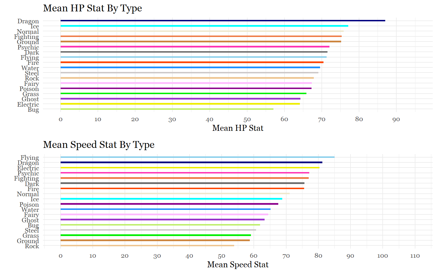
These next graphs were also taken from the Exploring Pokemon project.
Critiques
What is wrong with these charts?
Again, color choice is a problem for these charts. Additionally, there is a better way to answer the questions without having to create 7 separate charts.
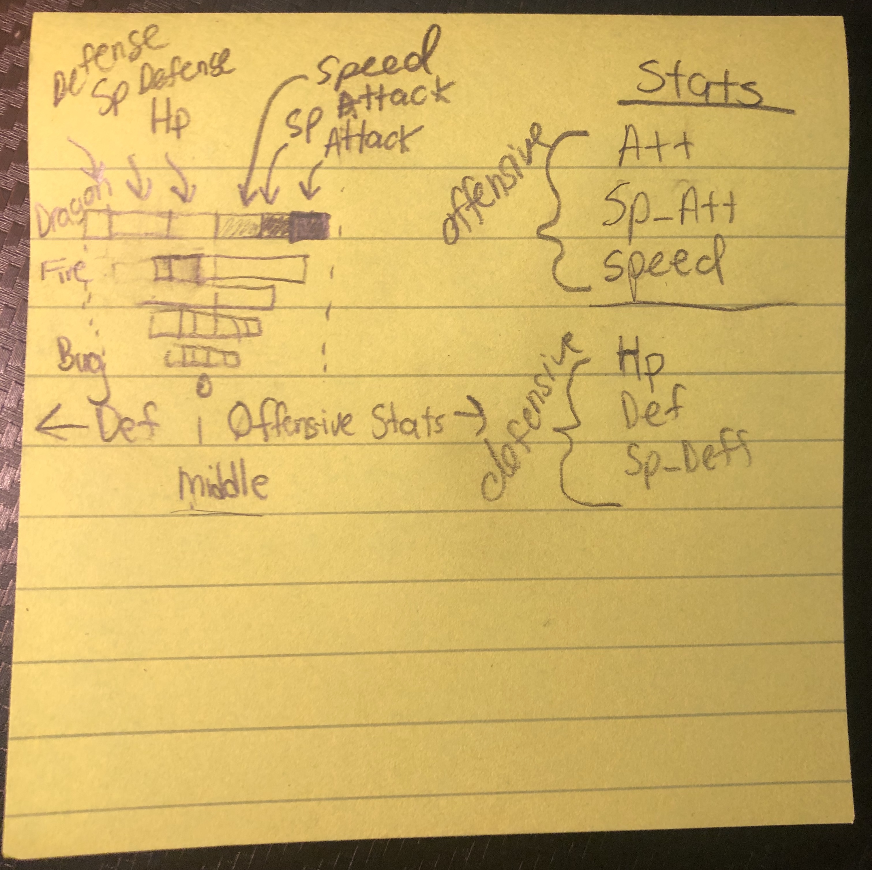
Ideation & Sketching
Original Question: On average, what are the strongest types based on individual stats and total stats?
The easiest way to address this issue is to simply make a dashboard that allows the user to pivot between stats. But splitting the graphs up doesn’t show some of the nuances that could probably be observed if all of the information was presented in a single chart.
New Question: Is there a way to display all of the data in a single chart and highlight more nuanced differences between the types?
The answer is, once again, yes. For this chart, I was inspired to not only showcase the different types but also present differences in stat distributions between the types. For example, electric Pokemon like Pikachu are typically Pokemon that are really fast, hit hard, but are very frail. Therefore, my expectation would be to see the average stats of electric Pokemon to be more offensive than defensive. This idea of competitive battle roles is something I investigated later on in the Exploring Pokemon project using regression frameworks. By using an interactive diverging stacked bar chart, I could quickly highlight some of those mean battle role differences between types.
Here is another rough sketch of what I was thinking:
Sketch 2
Coding
Let’s now go get the data.
# Make sure Pokemon are counted for each of their types
pokemon_stats<- pokemon_data %>%
  select(name, type_1, attack, defense, sp_attack, sp_defense, speed, hp, total_points) %>%
  mutate(type_half = type_1) %>%
  select(-type_1)

pokemon_stats2<- pokemon_data %>%
  select(name, type_2, attack, defense, sp_attack, sp_defense, speed, hp, total_points)%>%
  mutate(type_half = type_2)%>%
  filter(type_half != "")%>%
  select(-type_2)

pokemon_stats_combined<- rbind(pokemon_stats, pokemon_stats2)

# Get average stat per type (Defensive stats were made negative for the diverging chart)
pokemon_stats_summarized <- pokemon_stats_combined %>%
  group_by(type_half)%>%
  summarize(mean_attack = round(mean(attack)),
            mean_sp_attack = round(mean(sp_attack)),
            mean_speed = round(mean(speed)),
            mean_defense = round(mean(defense))*-1,
            mean_sp_defense = round(mean(sp_defense)*-1),
            mean_hp = round(mean(hp)*-1),
            mean_total = round(mean(total_points)) ) %>%
  pivot_longer(cols = mean_attack:mean_hp, names_to = "stats",  values_to = "points")%>%
  mutate(stats = as.factor(stats))%>%
  mutate(stats = fct_relevel(stats,
                             "mean_attack", "mean_sp_attack", "mean_speed",
                                                   "mean_defense", "mean_sp_defense", "mean_hp"))%>%
   mutate(stats = dplyr::recode(stats,
                                 "mean_attack" = "Attack" ,
                                "mean_sp_attack" = "Special Attack",
                                 "mean_speed" = "Speed" ,
                                "mean_defense" = "Defense",
                                 "mean_sp_defense" = "Special Defense",
                                 "mean_hp" = "HP"))

head(pokemon_stats_summarized)
The last time I did this data manipulation, 7 data frames were created. This time there is only 1.
Up next is the pallet. Since we need 6 colors for the 6 stats, I need to make sure that I am choosing a pallet that does not violate chart design principles and is accessible to color-blind individuals. One of my favorite resources is the Viz Pallet tool which allows users to see if there are clashing colors or accessibility issues in pallets.
second_pallet <- c("#d84008", "#f79350", "#fffdae", "#00389E","#6bb5d5","#d9eef6")Now it’s time to visualize.
breaks_values <- pretty(pokemon_stats_summarized$points * 1.5)

plt<- ggplot(pokemon_stats_summarized,
       aes(y = reorder(type_half, mean_total),
           x= points,
           fill = stats,

            text = paste("Type:", type_half, "<br>",
                          "Stat:", stats, "<br>",
                          "Points:", abs(points)))) +
  geom_col(position = "stack")+
  scale_fill_manual(values = second_pallet, name = "")+
  labs(title = "Mean Stat Distributions by Type",
       x= knitr::asis_output("\U2190 Defensive Stats  |  Offensive Stats \U2192"),
       y= "")+
  scale_x_continuous(breaks = breaks_values,
                     labels = abs(breaks_values))+
  theme_minimal() +
    theme(axis.text.x = element_text(size= 8),
                panel.grid.major.x = element_blank(),
        text = element_text(family = "Georgia"))


ggplotly(plt, tooltip = "text")%>%
  layout(title = list(x = 0.5))%>%
  style(hoverlabel = list(font = list(family = "Georgia")))
This interactive chart gives a variety of options for inspecting the data. Plotly allows users to hover over bars, zoom into particular sections, and even select particular categories.
Sources
Kunst (2019, Feb. 4). Data, Code and Visualization: Using tooltips in unexpected ways. Retrieved from http://jkunst.com/blog/posts/2019-02-04-using-tooltips-in-unexpected-ways/
Tom Bishop’s Highcharter Cookbook